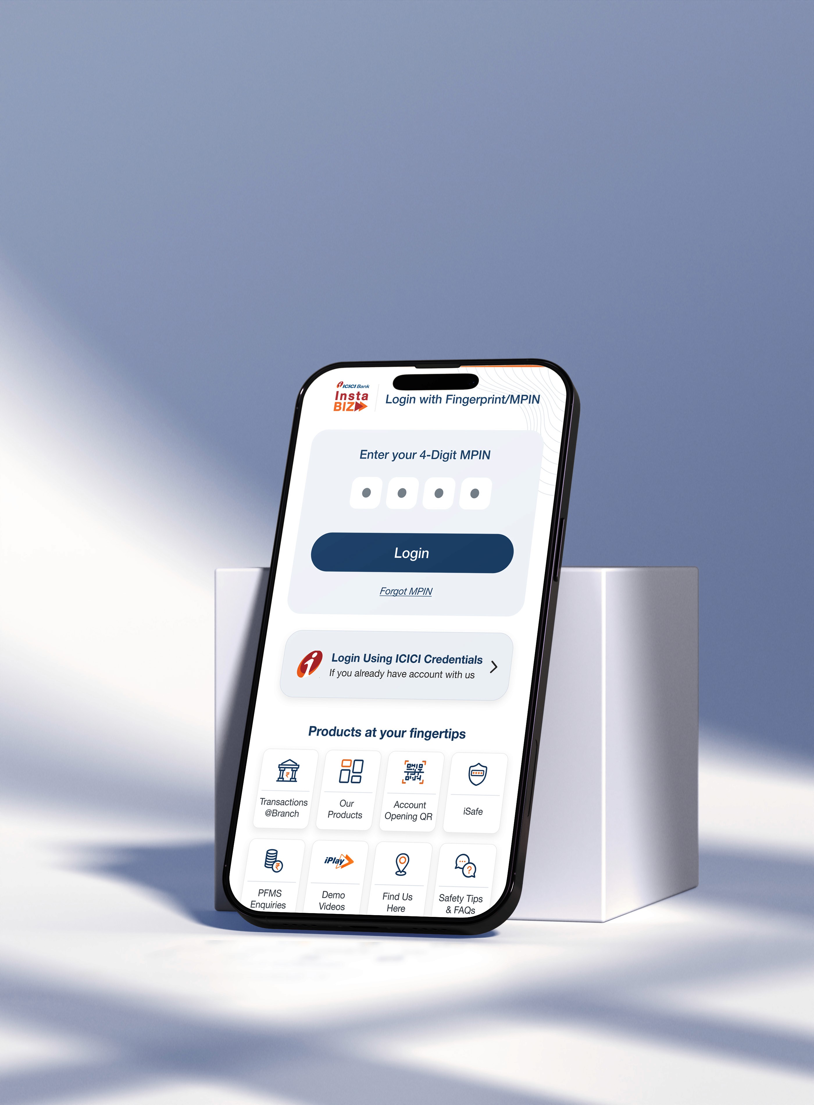
The legacy ICICI InstaBIZ app, built for MSMEs and business users, was cluttered, outdated, and difficult to navigate. Poor visual hierarchy, unclear categorization, and scattered navigation made key tasks like fund transfers, UPI collections, and GST filing hard to complete. The experience was especially challenging for non-digital-first users. A complete UX/UI overhaul was needed to enhance usability, speed, and user trust.
To redesign the InstaBIZ mobile experience into a visually modern, intuitive, and task-focused platform that enables business owners to quickly manage collections, access top services, and navigate financial operations without confusion.

Challenges
Overwhelming interface with poor visual hierarchy
Scattered and redundant navigation layers
No differentiation between critical and secondary features
Lack of modular, user-specific experiences for merchants
Promotional cards disrupting the user’s task flow
High drop-off rates due to cognitive overload
Action taken
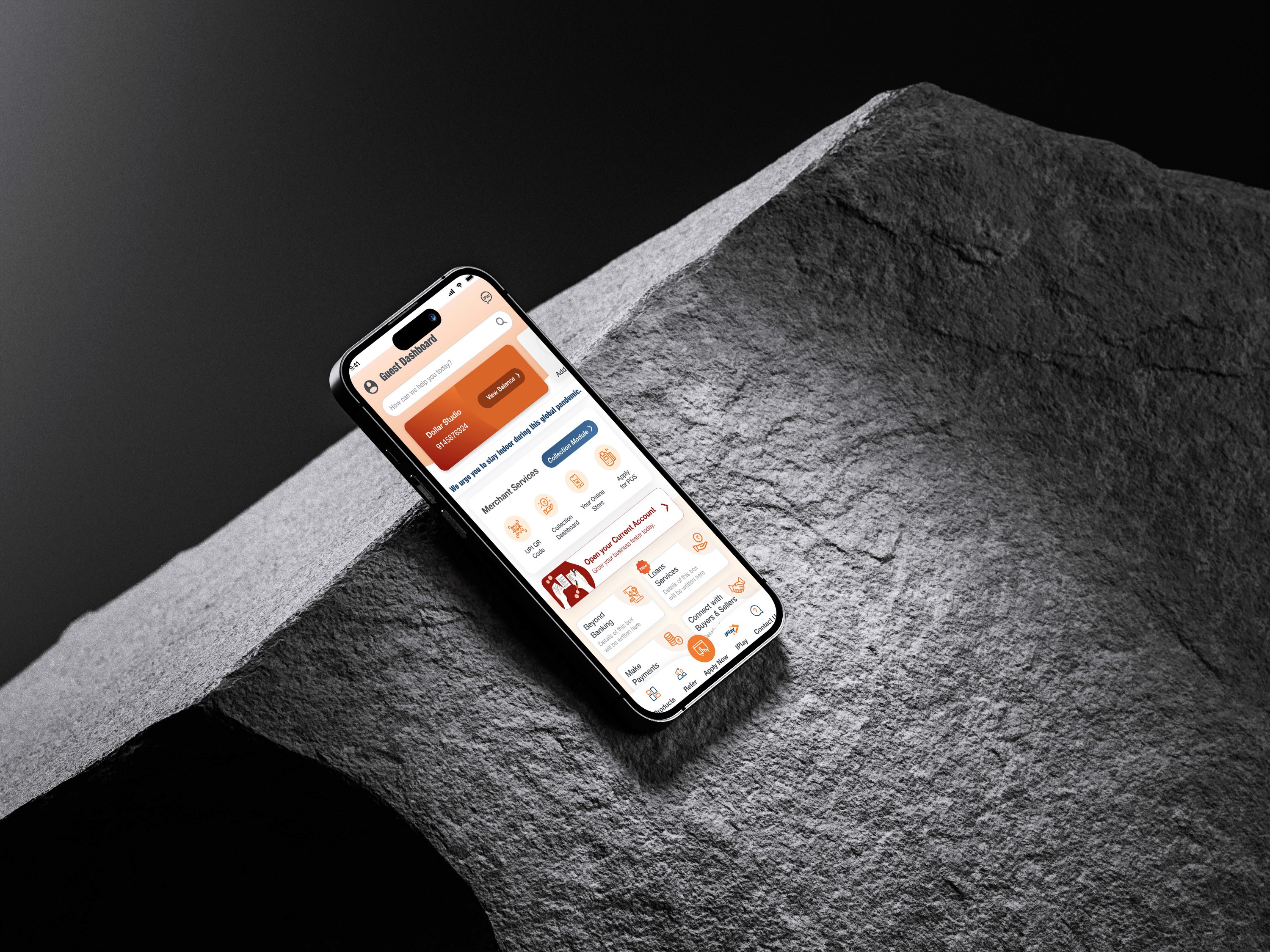
I led the redesign of the dashboard and key workflows with a user-first approach, beginning with audits of existing flows and pain points. I created task-oriented layouts that brought frequently used actions like UPI collection, today’s payments, and account insights to the forefront.
A modular card-based system was introduced, segmenting data and services logically for easier scanning. I also introduced role-based customizations, improved iconography, reduced visual noise, and structured bottom navigation to streamline access.
We validated concepts through usability tests with merchants and business users to ensure the new system worked for different usage styles—daily transactions, vendor tracking, and account management.
Outcomes & Impact
Task completion time for high-frequency actions reduced by 40%
User retention improved by 28% in the first 2 months post-launch
Feature discoverability increased due to better grouping and CTA clarity
Guest dashboard feature drove wider adoption and onboarding of new users
Enhanced user trust and satisfaction, especially among business owners managing transactions on the go
Key Design Decision
A pivotal decision was to redesign the home screen into task-specific modules (e.g., “Today’s Collections,” “Collect Through,” “Top Services”) instead of presenting all services equally. This shift prioritized user intent, significantly reducing cognitive load and improving the overall flow.