Product 01, an AI-powered diversity hiring platform, had a legacy website that significantly hindered user experience. The interface was outdated, unresponsive on mobile, and lacked clear navigation. Users visibly struggled to complete essential tasks like job browsing, mentorship access, and learning enrollments. Usability testing revealed critical failures mobile interactions were broken, CTAs were inconsistent, and accessibility barriers (WCAG violations) excluded large user segments. The fragmented structure and outdated visuals undermined the platform's credibility and conversion potential.
The goal was to redesign Client’s website into a modern, accessible, and intuitive interface that reflects its mission of inclusive career building. The new UI needed to support seamless user flows, promote engagement, and convey trust to users from diverse backgrounds.

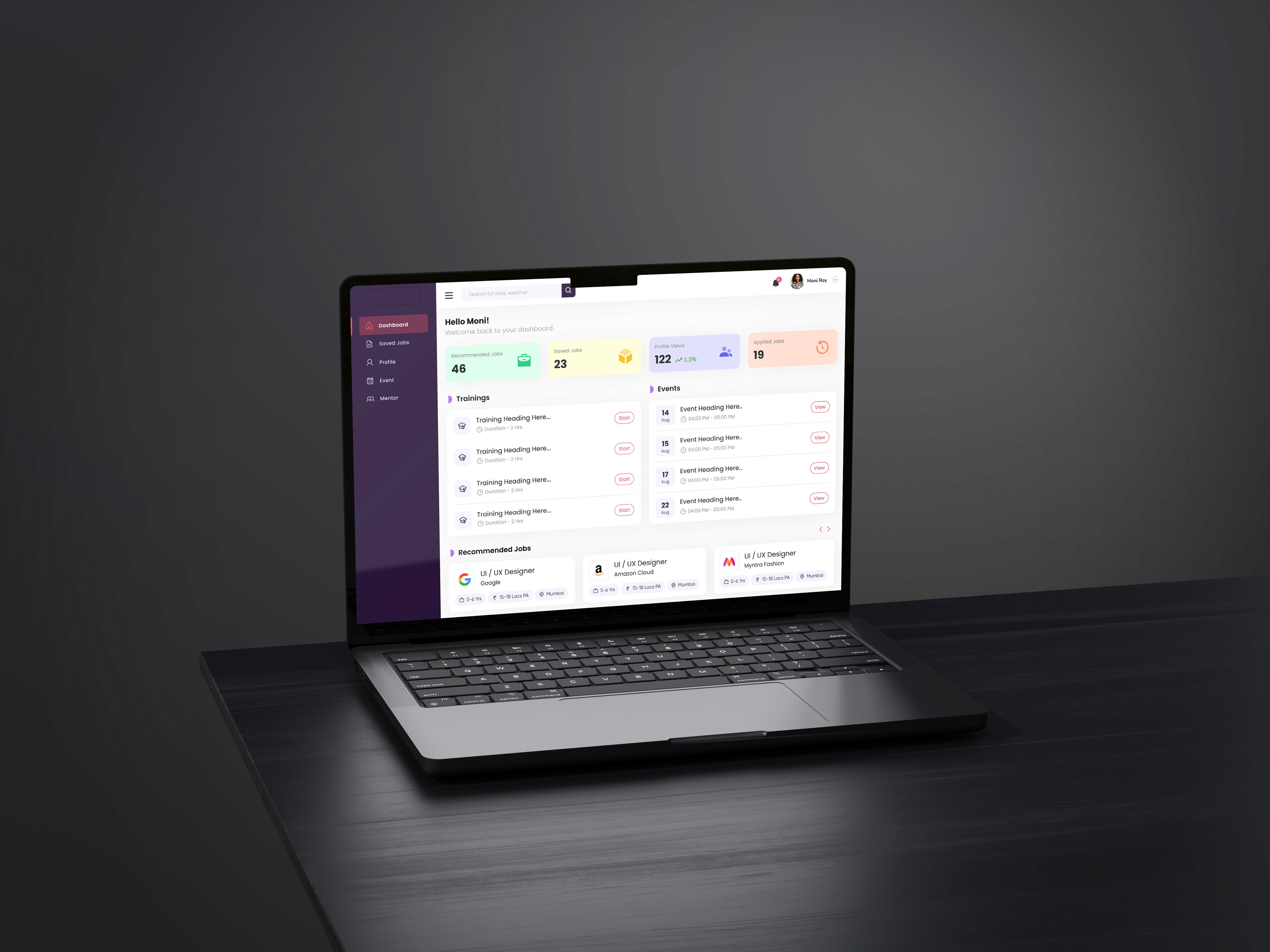
What I Did
I led a full UX overhaul, starting with a deep audit of the existing website and identifying key friction points. I restructured the information architecture, introduced a modular layout system, and applied an updated color system aligned with Shenzyn’s evolving brand. Each interaction was redesigned with clarity and purpose—placing dedicated CTAs at strategic points, improving scannability through visual hierarchy, and ensuring responsiveness across all devices. I also integrated accessibility standards to ensure WCAG compliance, making the platform inclusive for all users.
The Impact
The redesigned website led to measurable improvements across key metrics. Shenzyn experienced a 65% increase in business traction post-launch, with 34% of visitors being new users. There was a 12% rise in average session duration, indicating improved engagement. Bounce rates dropped, mobile usability scores improved dramatically, and stakeholders received consistent positive feedback from both users and hiring partners.
Key Design Highlight
One of the most impactful decisions was implementing a segmented onboarding flow that tailored the homepage experience based on user type (Job Seeker, Mentor, or Employer). This immediately improved relevance, reduced drop-offs, and made the experience feel more personalized from the very first click.


